
The block list
The left panel of the Page Content tab shows every block on your page, in the order visitors see them. Click a block to edit it. Its settings open in the center of the screen, and its Block Options appear on the right. Each block shows a colored icon that tells you its type, plus its name. Give your blocks clear names so the list is easy to scan.Adding Content Blocks
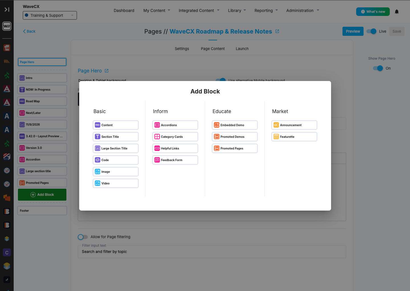
Add a block
- Click the green + Add Block button below your blocks.
- Choose a block type in the Add Block window.
- The new block is added to your page. Fill in its content and settings.
- Click Save in the top-right corner.
Block types
Blocks are grouped by what they help you do.Basic
The building blocks of a page| Block | Use it for |
|---|---|
| Content | Formatted text with headings, lists, links, images and a background |
| Section Title | A heading that divides the Page into sections |
| Large Section Title | A bigger heading for a major section |
| Code | Custom HTML or code, such as a video player or form. External sources need their domain approved first |
| Image | A single image |
| Video | An embedded video |
Inform
Help visitors find answers| Block | Use it for |
|---|---|
| Accordions | Expandable sections. Good for FAQs or long lists |
| Category Cards | A grid of cards that link to topics or categories |
| Helpful Links | A list of related links |
| Feedback Form | A form for collecting feedback |
Educate
Show users how things work| Block | Use it for |
|---|---|
| Embedded Demo | An interactive demo placed right on the page |
| Promoted Demos | A set of featured demos. |
| Promoted Pages | Links that point visitors to other pages. |
Market
Promote news and features| Block | Use it for |
|---|---|
| Announcement | A highlighted message for news or updates |
| Featurette | A feature showcase with media and text. |
Block Options
When you select a block, these options appear on the right:- Delete Block: Removes the block from the page.
- Duplicate: Makes a copy of the block, so you can reuse its layout and settings.
- Add anchor link: Gives the block a link label, such as “Product Roadmap.” This lets visitors jump straight to that section.
- Add action link to corner: Adds a call-to-action link in the corner of the block.