
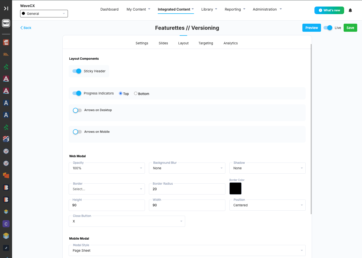
Layout Components
These controls help users move through the slides. When these controls are toggled on:- Sticky Header: when you have the Display Carousel Header on, this options keeps it fixed at the top of the window while users scroll through a slide’s content.
- Progress Indicators: these dots shows users which slide they’re on and how many are left.
- Arrows on Desktop & Mobile: shows previous and next arrows for moving between slides on desktop.
If Repeat slides is off, there’s no next arrow on the last slide.
Web Modal
Appearance
- Opacity: how solid the Featurette overlay window is.
- Background Blur: how much the page behind the overlay window is blurred.
- Shadow: adds a drop shadow around the overlay window.
- Border: the border style around the overlay window.
- Border Radius: how rounded the overlay window’s corners are.
- Border Color: what color the overlay window border is.
Size and position
- Height and Width: how tall and wide the window is.
- Position: where the window appears on screen.
Close Button
- Verbiage: choosing this option gives you a field to choose what the close button says
- “X”: shows an “X” for the close button instead of text
Mobile Modal
Appearance
- Modal Style: how the window opens on mobile. Options include:
- Page Sheet slides up from the bottom, like a native app screen.
- Overlay floats on top of the app’s content, like the desktop window.
- Header Title: the title shown at the top of the mobile window, for example “What’s New”.
- Header Color: click the square to choose the header’s background color.
Close Button
- Same functionality as web