
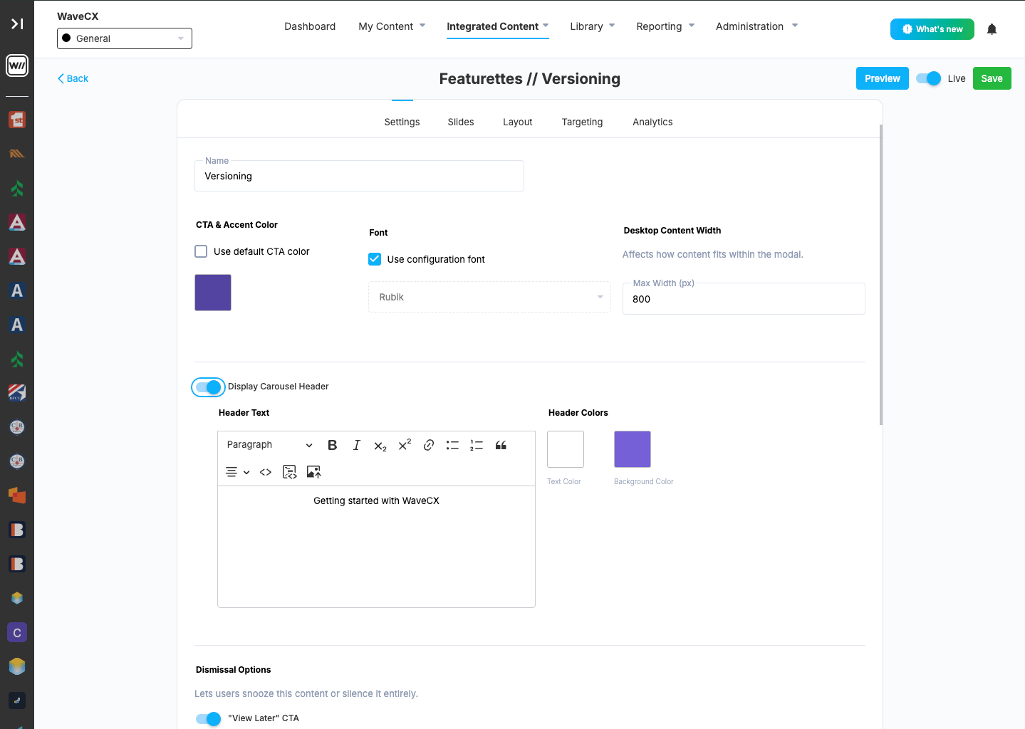
The Basics
1
Name your Featurette
The name appears at the top of the editor, after Featurettes //, and helps you find it in your list.
2
CTA & Accent Color
This color is used for the Featurette’s buttons and accents.
- Check Use default CTA color to use your organization’s standard color.
- To pick your own, leave the box unchecked and click the color square.
3
Set a Font
Use configuration font is checked by default, so the Featurette uses your organization’s standard font, for example Rubik. To use a different font, uncheck the box and pick one from the drop-down.
4
Set Desktop Content Width
Use Max Width (px) to set how wide the Featurette’s content can get on desktop screens, for example
800. A smaller number gives a narrower window. A larger number gives a wider one.Display Carousel Header
Turn on Display Carousel Header to show a header across the top of the Featurette’s slides. The header stays at the top while users move through the slides, so it’s a good place for a title like “Getting started with WaveCX”. When you turn it on, two sets of options appear. Header TextType the text you want in the header. The editor toolbar lets you format it:
- Paragraph drop-down: switch between normal text and heading sizes.
- Bold, Italic, Subscript and Superscript.
- Link: turn selected text into a clickable link.
- Bulleted and numbered lists, and block quote.
- Alignment: left, center or right.
- Code view (
<>): edit the header’s HTML directly. - Insert image: add an image, such as a logo, to the header.
- Text Color: the color of the header text.
- Background Color: the color of the header banner behind the text.
Choose colors with enough contrast that the text is easy to read.
Dismissal Options
These options let users snooze the Featurette or turn it off for good. Each option adds a button to the Featurette, “View Later” and “Don’t Show Again”, and you can turn each one on or off separately. When enabled, one or both appear in the Featurette’s footer, next to each other.“View Later” button
Turn this on to give users a button that hides the Featurette for now.- Button Style: choose how the button looks, for example Icon.
- Button Text: the button’s label, for example “View Later”.
- Make CTA full width on mobile: Check the box to have the button fill the phone screen width.
- Days: the number of days before it shows again, for example
- Sessions: the number of sessions before it shows again.
Leave a field blank to skip that limit.
“Don’t Show Again” button
Turn this on to give users a button that dismisses the Featurette for good. The user won’t see the Featurette again unless an admin resets it or changes the targeting.- Button Style, Button Text and Make CTA full width on mobile work the same way as for View Later.
- Confirmation Prompt: the question users see, for example “This message won’t be shown again. Continue?”
- Confirm Button Text: the label on the confirm button, for example “Continue”.
- Cancel Button Text: the label on the cancel button, for example “Cancel”.